5 hospitality design trends you need to know for 2017
Hotel Management has published a recent article on 5 hospitality design trends you need to know for 2017, featuring Jessica Lotner of McBride Company, a senior interior designer whose insights on hotel design elements are there to inspire you and set you on the hottest trends.
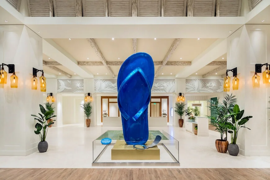
Pops of color and live plants give the lobby of the Margaritaville in Hollywood, Fla. a sense of space.
1. Colours that Pop
Lotner said that in the recent 5-10 years, neutral colours reigned supreme. However, bit by bit, clients asked Lotner’s team to inject in some colour which she describes as “stark minimalism with a twist.”
“With a neutral base, we’re infusing deep, saturated colors, creating bold, striking experiences in the space.” A primary reason for this, she said, is that as millennials choose hotels on sites like TripAdvisor, they seek out the most eye-catching pictures. With less brand loyalty than previous generations, these guests are opting for elements that photograph well. “Millennials are digital, so they want to share pictures. We’re providing them with something to photograph—something in lobby, a selfie they can share with friends.”
Beyond that, she said, many homes are decorated in neutral colors. “When they go to hotel with bold color, in their minds, it’s different. It’s fun, vivid, as opposed to their comfortable home.”
Suppliers like Restoration Hardware are offering elements to create what Lotner calls "rough luxe."
2. Warmer Metals, Rougher Luxury
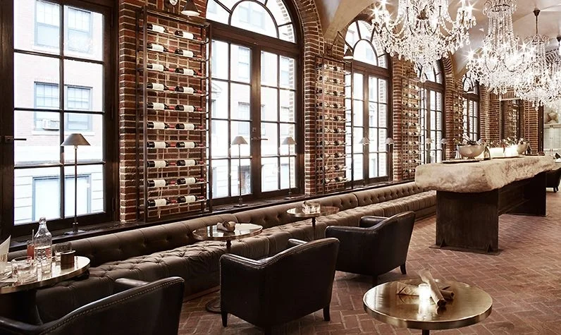
In the year gone, Lotner said, “cool” metallic tones have paved way for gold, bronzes and warmer metals. “Prepare to start seeing even darker metals, such as dark bronze, incorporated into interiors,” she said. “The great thing about it is that it hides imperfections and ages well.”
This “rough luxe” look, is a reaction to the “polished, glossy, flawless” spaces that have been trendy for years. “People love the emergence of rough luxe,” Lotner said. “It shows the provenance and the history of the space. In imperfections, you find luxury. If something has history, a story to it, that brings luxury to it.”
For designers, she said, the “rougher” styles can be fun, giving them a chance to play with hammered metals and warmer tones. “It shows the artist’s touch and it ages beautifully,” she said. “It’s okay to have a patina or blacker, worn-down areas. It sets a tone in some minds that it’s okay not to be perfect. There’s something lovely about it.” Lotner recommends using these metals on door hardware or dividing screens, and even with lighting fixtures. “Lighting is the jewelry in a space,” she said. “It’s the voila moment. It sets the tone. By doing that with warm metals and lighting, you can play with textures.” We’re wrapping warm metals with rope or textures on glass-netting. Sets the tone.
3. Steampunk Enters the Mainstream
Steampunk - the combination of Victorian fashion and modern technology is like putting the inner workings of an elegant clock on display - has gone from niche to nouvelle. The trend is going from one art medium to another, from Cirque du Soleil to fashion shows. “Now, it’s kind of a subcategory because of rough luxe,” Lotner said.
In terms of design, hotels can include steampunk elements with warmer metals, leather, exposed brick and “beat-up” decor. “You’ll see elements of it in light fixtures and furniture—in the hardware, there’ll be nuts and bolts.” Artifacts that set the stage to tell a story will be used as decorative touches—look for maps and globes, sepia-toned photos and object-oriented decor. “Accessories that set the decor are a cue to someone that they’re in a unique space,” Lotner said. Major designers are also incorporating steampunk elements, she said. “Restoration Hardware seems like it’s greatly influenced by steampunk. It’s mainstream, but some elements are in entire lines.”
4. From Outdoor to Indoor
From upholstery to wood finishes to living plants, outdoor elements are increasing in popularity in interior design.
The trend began in the 1990s by Philippe Starck. “I remember going on the deck of a hotel and they had these oversized potted plants. He introduced green walls into the space. Since then, people are having fun with that idea, especially in cities,” said Lotner. Greenery goes a long way in giving a hotel its own sense of space, and helps guests feel like they’re truely in a city.
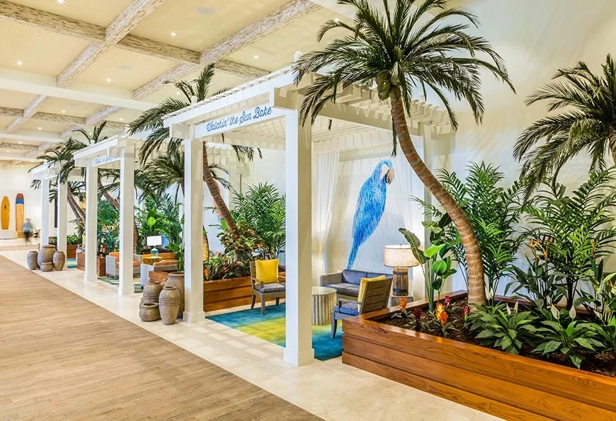
Lotner worked on the Margaritaville Hotel in Hollywood, Fla., and at the time of the interview was working on another in Orlando. “That lobby is a great example,” she said. “When you walk in the door, the limestone floor has embedded shells. We organized the layout of lobby so that there are nooks with cabanas. And within those cabanas, we put hanging sofas. It’s organized with planters that form the furniture plan. You walk around the planters filled with all sorts of plants and palm trees. Immediately, somebody feels like they’re on vacation in a tropical place, and they’re relaxed. They can put their feet up on the sofa. You see it as people walk through the space. They’re leaning back, enjoying themselves. It’s an inexpensive but effective way to set the stage.”
Hanging screens with cabanas in a lobby or using outdoor lanterns can set a tone, Lotner said. “Outdoor fabrics are fabulous these days. The textures give a casual elegance.” With guests increasingly concerned about how eco-friendly their hotels are, having live plants in the decor sends a message of environmental awareness.
The lobby of the Margaritaville in Hollywood, Fla., uses outdoor elements to create a sense of space.
5. The Writing is Still on the Wall
It has become quite popular for designers to incorporate text in their hotel designs. Whether it is embossed on the floor of a hotel lobby or a menu printed on the wall, it’s a great way to get people to stop and pause.
“Take a little line of a song, put it on a wall and it becomes a message. It’s fun and playful but eye-catching—and almost a moment of self-reflection. It’s the simplest way of creating an eye-catching design element. I’ve seen restaurants where it’s an entire wall with exposed brick, and one line of text. It makes the space,” said Lotner.
“I was in a restaurant where the bar stools—these old, cool, rough wood bar stools—on the top of seat had ingrained the words, ‘have a seat.’ That detail made the whole space. It brought something playful and whimsical. It’s a fun design element.”
For a designer, she added, incorporating text into the decor can bring the entire project full-circle. When designers begin to imagine what a space can look like, she said, they “infuse” themselves in research. A poem or a song lyric can be an inspiration from the get-go, and can convey the hotel’s message to its guest. “It goes back to the message of what you want people to experience,” she said. “Think about what that message is—but do it with a twist, so it isn’t beating someone over the head. Edit it down to the essence.”
To read the source article, click here.


